You run your business. We'll handle this part.
WSU Institutional Data
WSU Data Website
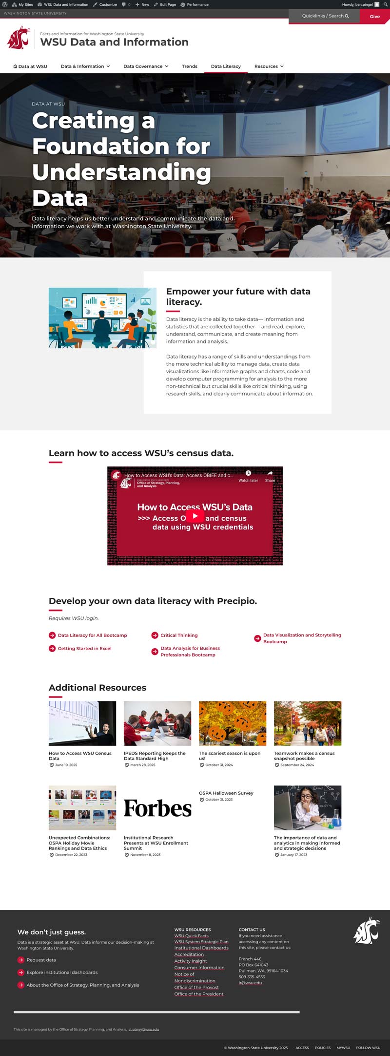
The WSU Institutional Data Platform was built to make complex university data easier to explore and understand. I led the design and development of the website, organizing dashboards, metrics, and reports into a clear, intuitive system used across the university.
Organization: Washington State University
Scope: University-wide initiative
Role: Director of Strategic Communication
Key Deliverables
- Information architecture and site structure
- Website design and development
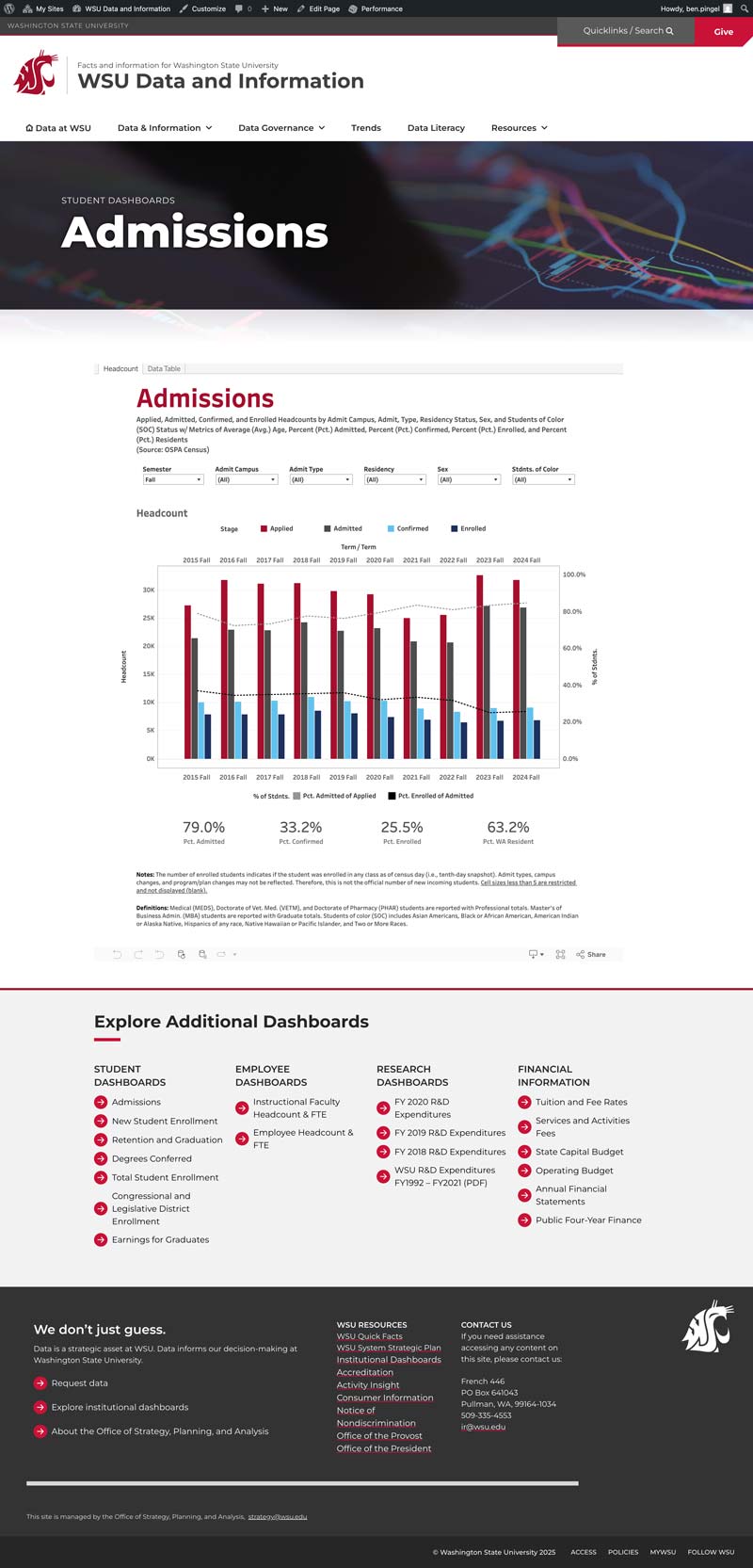
- Dashboard integration and layout design
- Dashboard visual branding and readability improvements
- Data navigation and user experience design
Project Scope
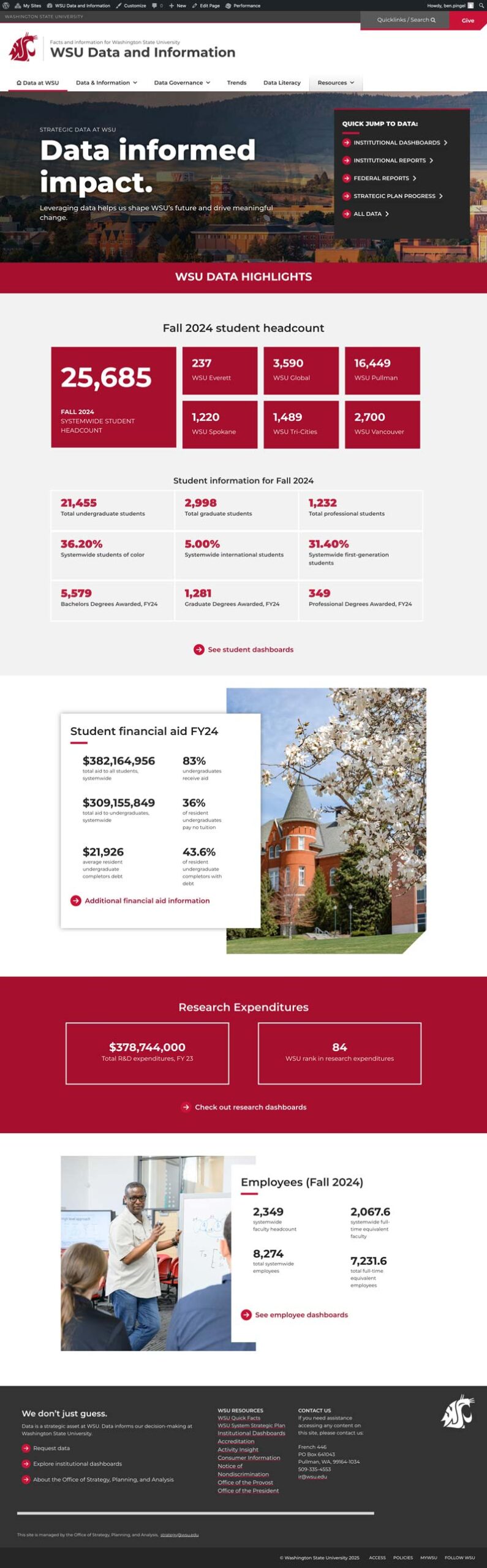
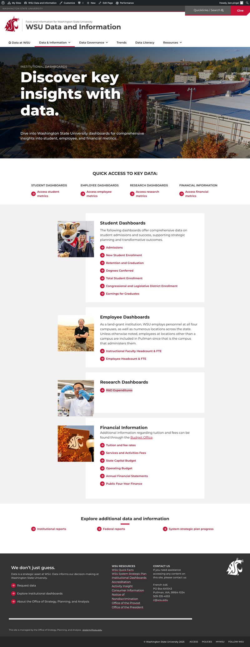
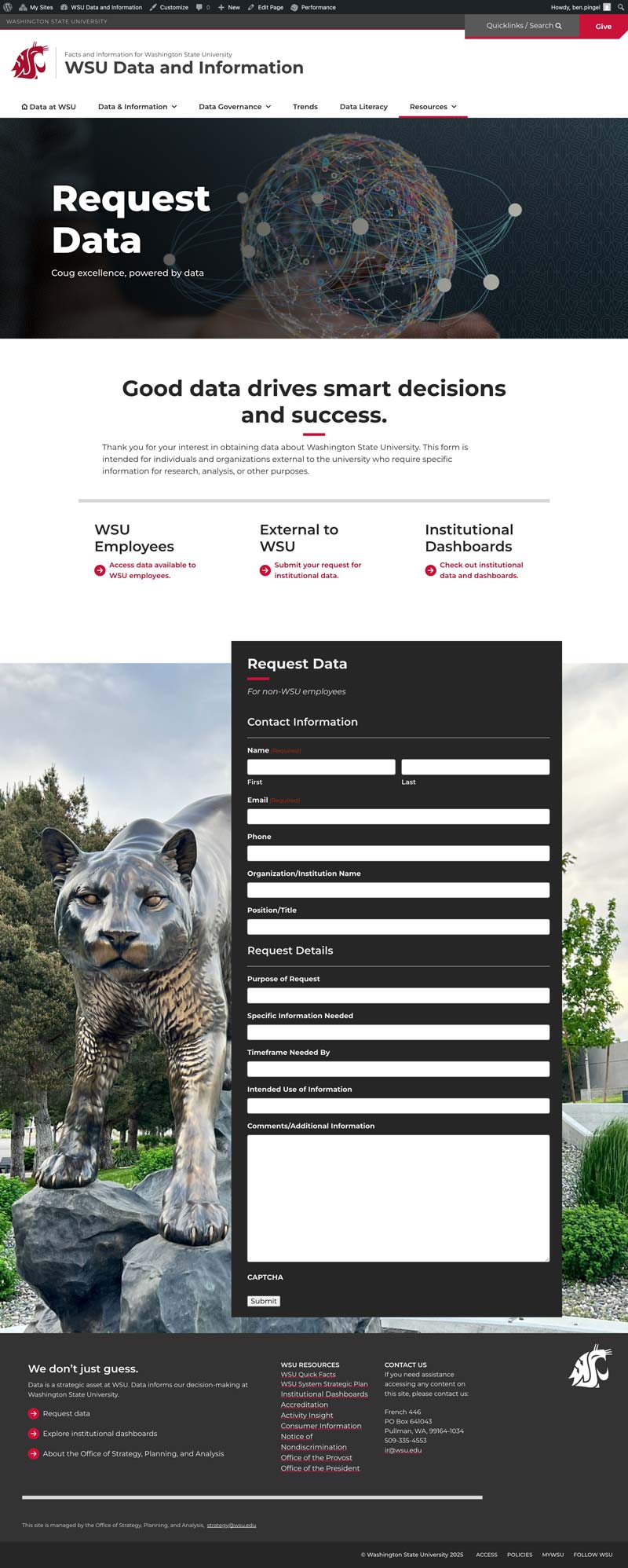
I led the design and development of the data.wsu.edu website while serving as Director of Strategic Communication at Washington State University. The project focused on creating a central place where institutional data, dashboards, and reports could be explored and understood across the university.
The work included designing the site structure, building the homepage and key pages, integrating dashboards, and improving the visual presentation of the data so it would be easier for people to read and interpret.
The Challenge
Universities generate a large amount of institutional data, but it isn’t always easy to organize or navigate. The goal of the data platform was to bring many different dashboards and reporting tools together into one clear, structured website.
The challenge was making sure the site could handle a lot of information without feeling overwhelming. The structure needed to help users quickly find what they were looking for while still allowing deeper exploration of the data.
Our Approach
The project started with extensive work on information architecture. I spent significant time mapping how the data should be organized, how users would navigate between dashboards, and how different sections of the site would connect.
The homepage was designed to present a large amount of information in a way that still felt clear and readable. I also worked with the analytics team to refine the styling and branding of the dashboards themselves so the data would be easier to interpret and visually consistent across the platform.