
More pages and more detail usually make a site harder to use. Here's how to decide what belongs, using a healthcare site as the example.
Enough to answer the questions a first-time visitor actually has, and no more. Most small business sites don't fail because they're missing information. They fail because everything is there, all at once, with no clear order. Structure beats volume nearly every time.
Healthcare sites are the clearest example of this problem, which is why I think about it every time I build one.
More information usually makes a site harder to use
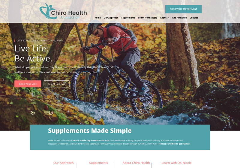
Chiro Health Connection came to me needing a professional website that explained their services and made it easy for new patients to reach out. The challenge wasn't a shortage of things to say. Clinics have plenty: treatment types, conditions, insurance questions, new patient paperwork, hours, credentials, philosophy of care.
Pile all of that onto a page and a first-time visitor has to do the sorting. Most won't. They'll scan, get overwhelmed, and leave without doing the one thing you actually wanted them to do.
Decide what a first-time visitor needs to know
Before writing a word, figure out who's landing on the page and what they came to find out. For a chiropractic practice, a new patient usually wants three things: do you treat what's bothering me, do I trust you with it, and how do I get an appointment.
Everything that answers one of those goes up front. Everything else goes deeper in the site or comes out entirely. That's the whole editing test, and it works for almost any service business.
Structure does the work that volume can't
We built the site with a simple structure that walks visitors through the most important information first, then organizes the services so people can find the detail they want without wading through everything.
The information is still there. It's just sequenced. That's the difference between a site that feels thorough and a site that feels exhausting.
Build it for the phone, because that's where people read it
A wall of text on a laptop is annoying. On a phone it's impossible. We designed for mobile from the start, along with contact and appointment integrations and social and review connections, so someone can go from reading to booking in a couple of taps.
If you're deciding whether a section earns its place, read it on your phone first. Long sections get very hard to defend at that size.
Give people one obvious next step
Every page should make the next move clear: call, book, ask a question. When the path is obvious, clarity turns into appointments. Here's what Nicole said in her review:
"Ben genuinely is so talented and thinks of every little detail. He has helped my business out so much."
The details she's talking about are mostly the unglamorous ones. Where the phone number sits. How the services are grouped. What the button says. Those decisions do more for a small business than any visual flourish.
Where to start if your site feels bloated
Open your homepage and ask what a stranger needs to know in the first ten seconds. Then look at everything else on the page and decide whether it helps answer that or competes with it. Move the competing parts deeper into the site.
If you'd rather have someone else make that call, grab a free website review and I'll tell you what I'd cut, what I'd move, and what's fine where it is.