
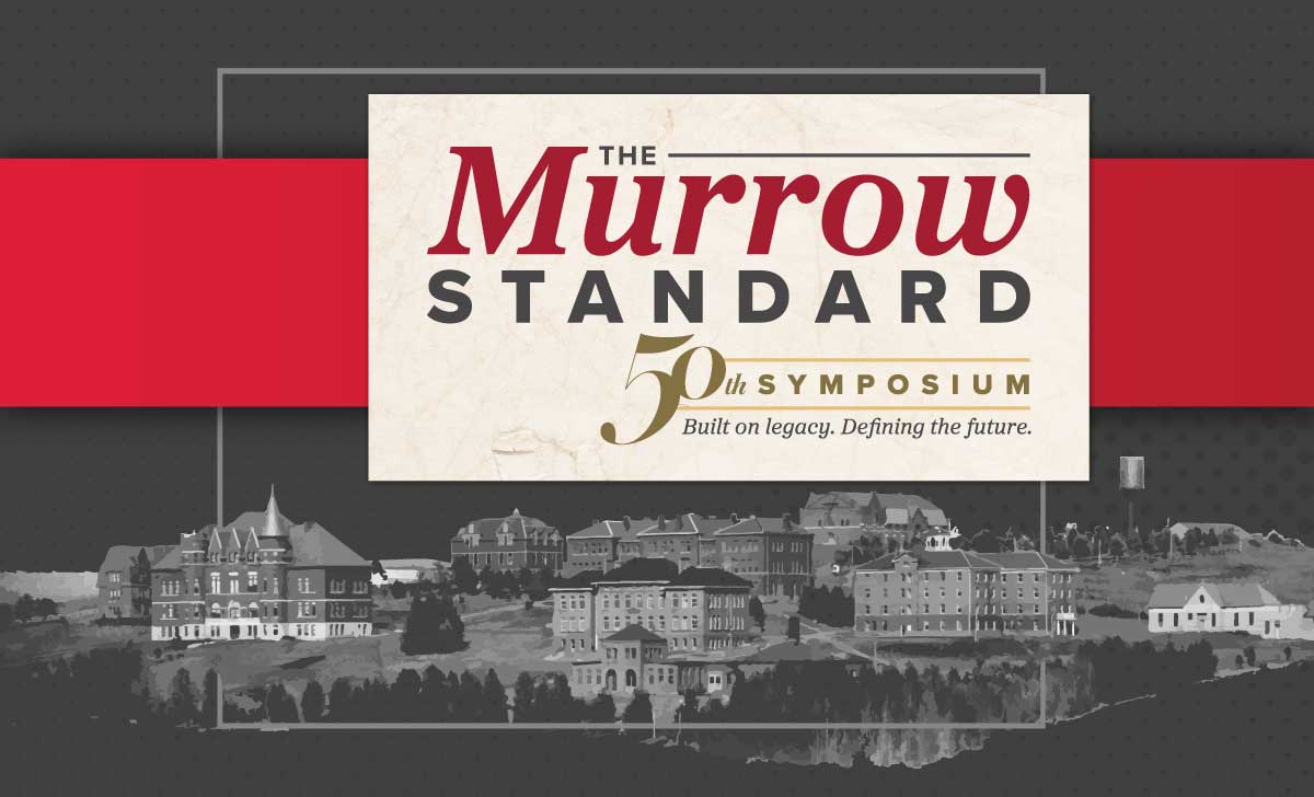
What a 50th anniversary identity for WSU's Murrow College shows about building one idea into every piece your customers see.
Because consistency is what makes you look established. When your logo, colors, message, and materials all come from one idea, people read you as a real, settled business. When they don't match, people sense something is off even when they can't name it, and you look smaller than you are.
The clearest example I've worked on recently wasn't a small business at all. It was a 50th anniversary.
One clear idea answers a hundred design questions
Every spring, Washington State University's Murrow College of Communication brings students, alumni, and industry leaders to Pullman for the Murrow Symposium. It started in 1973 as a single panel honoring Edward R. Murrow. This year it turned 50.
Murrow College gave us the theme, "The Murrow Standard," and the tagline, "Built on legacy. Defining the future." When I read the theme, I heard a newspaper masthead. That was the whole unlock. Murrow's roots run through journalism, so we built the visual system on an editorial foundation: strong headlines, confident type, the feel of a front page. Bold, modern execution kept it from feeling nostalgic and made the point that Murrow students will lead what comes next.
After that, every decision got easier. Should this sign feel like a headline? Yes. Should the program read like a paper? Yes.
Constraints make the system stronger
Everything had to work inside WSU's established brand standards. The timeline ran roughly four months from kickoff to the event. And one system had to stretch across stage, print, digital, video, and swag while every piece still looked related.
I like constraints. Brand standards keep you honest. A tight timeline forces you to decide what matters. When you know the boundaries, you spend your creativity inside them instead of arguing about where they are.
Build the core first, then roll it out in phases
We didn't design everything at once. We developed the event mark and identity first, then rolled it out.
The biggest single piece was a 20-page commemorative newspaper, which now lives on the Symposium website. Around it came the stage backdrop, event and table signage, a printed program, swag, social media templates, a website hero banner, and video and presentation graphics. Different formats, different audiences, one look.
Your business needs the same discipline at a smaller scale
You probably don't need a 20-page newspaper. But you do need what made that project work: one clear idea, carried consistently everywhere people meet you.
For a small business that means deciding the one thing you want people to understand and feel about you, building your core identity around it, and then rolling it out piece by piece to your website, cards, social graphics, signage, and email signature.
The order matters. Start with the pieces and you end up with a pile of things that don't quite match. Start with the idea and the pieces fall into place.
Where to start if your pieces don't match
Look at your logo, your website, and your last three marketing pieces side by side and ask whether they came from the same idea. If the answer is no, the fix usually starts above the design, not inside it. A two-hour strategy session for $250 will get that idea written down, and everything after that has something to build on.